Works best for
Architecture, landscapes, portraits or still lifes with a clear hero subject, strong silhouette and enough empty space for oversized typography.
Tested AI art skill · 3 source photographs
A forceful two-ink editorial treatment that preserves recognizable silhouettes while turning photographs into screen-printed poster systems. Across all three tests it handled a single dominant subject more clearly than a scene made from many equally important objects.
Architecture, landscapes, portraits or still lifes with a clear hero subject, strong silhouette and enough empty space for oversized typography.
Fine colors and subtle materials are intentionally discarded. Busy scenes can become visually dense, and generated headline text may compete with small subjects.
Each result is the retained first attempt. No manual image edits or automatic retries were used, so the comparison shows both the skill’s strengths and its practical limits.
The symmetrical facade remained immediately recognizable, and the rose window became an effective red focal collision. Strong geometry makes this the clearest of the three applications.
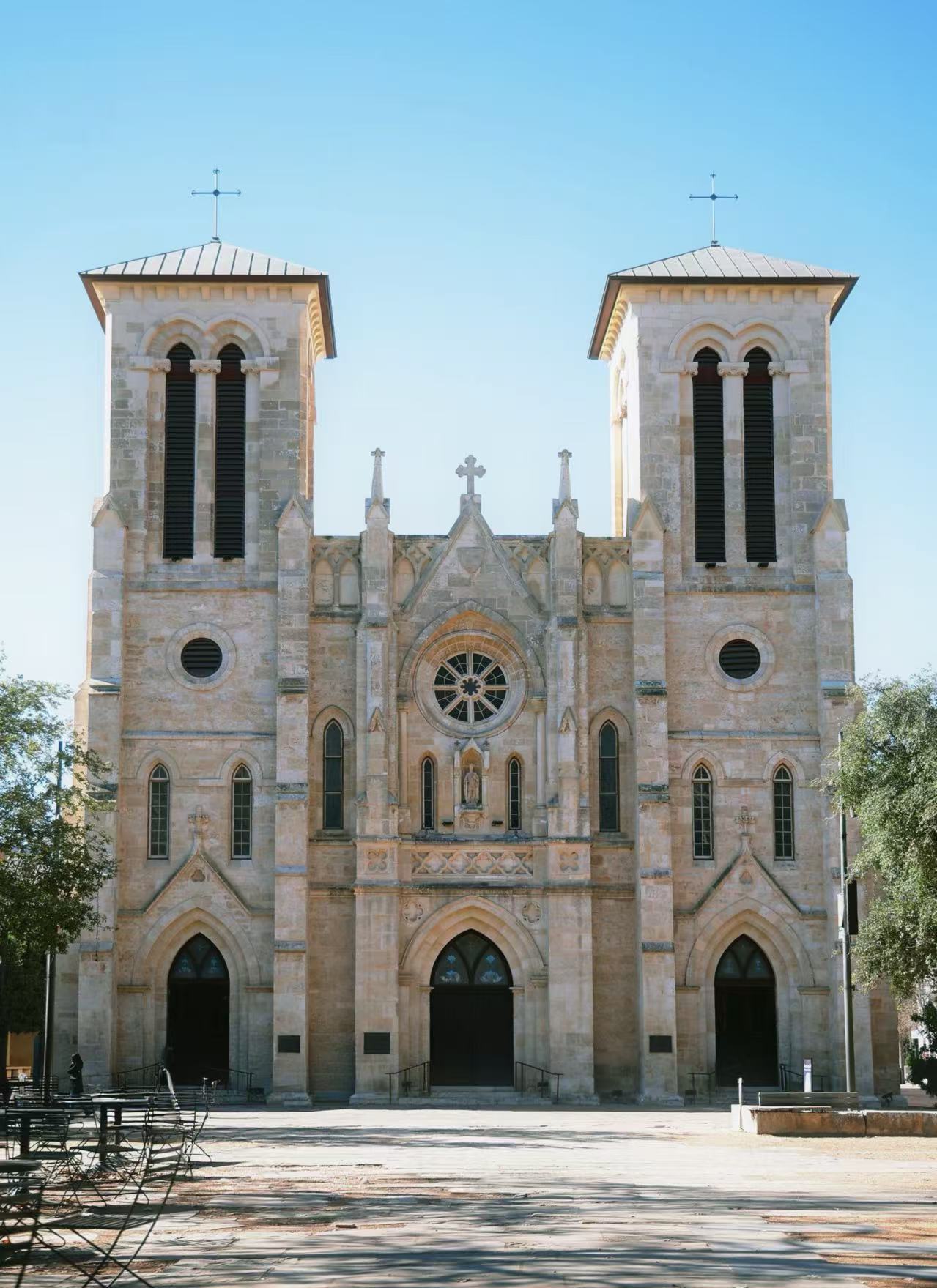
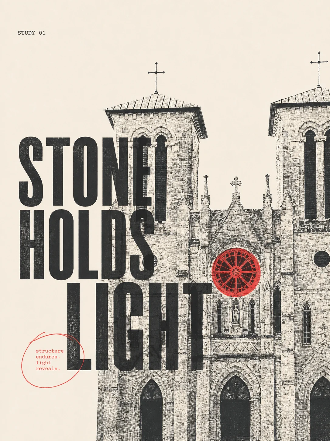
Create a vertical 3:4 Monocolor Editorial Print from Image 1. Use Pale Beige substrate #F5F1E8 and controlled chromatic ink + black: dominant Charcoal #30343A for the screened architecture and functional text, Signal Red #C83232 only for the rose-window focal plate and one small annotation, never more than 20% of printed area. Flat front-facing paper, no frame or mockup.
Use an image-field layout with balanced tension, 35% visibly empty paper, 6–8% outer margins, and one decisive off-center crop. Preserve the paired towers, central rose window, pointed arches and recognizable frontal geometry, but convert the photograph into medium halftone and clean plate separation. Let the building occupy about 60% of the page, crop decisively at the lower and right edges, and let exposed paper cut through selected highlights. The single focal event is the red rose window colliding with the headline; reserve the upper-left as a quiet release zone. Use one hand-drawn circular annotation as the sole manual gesture.
Exact display phrase: “STONE HOLDS LIGHT”. Set it in a condensed civic sans with a 7× scale jump over tiny monospaced support text; split or tightly lock the headline across the architecture and red aperture rather than placing it in a safe detached zone. Add only one tiny neutral label: “STUDY 01”.
Use visible halftone dots, slight ink-density variation and 1 mm plate misregistration. Contemporary editorial, not automatically vintage. No more than two inks, no full-color photo, gradient, glossy depth, cinematic lighting, hard shadow, 3D, centered template symmetry, sticker, scrapbook, distressed border, long text, marketing copy, logo, URL, QR code, watermark, or artist imitation.
The clocks, mannequin and plants survived the halftone reduction, but several objects compete for attention. It works as an energetic editorial still life rather than a clean product record.


Vertical 3:4 Monocolor Editorial Print on Neutral White #FAFAF7, complementary duotone Mint Green #5EB783 dominant plus Charcoal #302D2E accent/support. Specimen-annotation layout, 35% empty paper, 7% margins. Preserve central torso display, clock circles and plant silhouettes through medium halftone and clean plate separation; isolate one giant torso crop occupying 55–65%, paper knockouts cutting through highlights. Exact display phrase “OBJECTS KEEP TIME” in wide cultural grotesk locked tightly against the torso; tiny support “STUDY 02”. One hand-drawn annotation line only. Mint plate carries plants/body field; charcoal carries clocks/type. Visible dots, slight misregistration, no third ink, full color, gradient, glossy mockup, 3D, logo, QR, watermark or extra text.
The mountain reads well as one broad blue mass and the orange walker creates scale. Large display type dominates, so this is best when poster impact matters more than an unobstructed landscape.

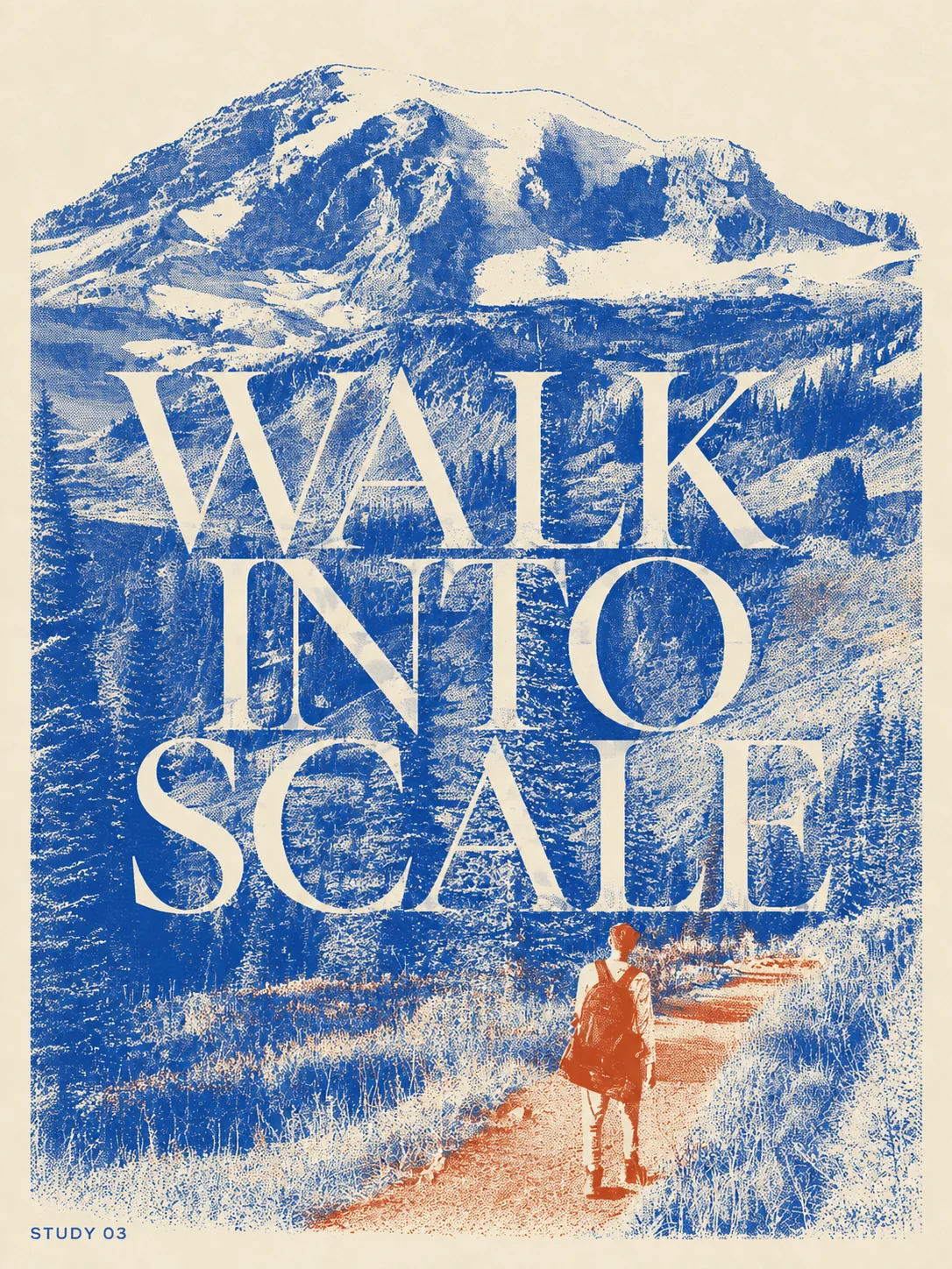
Vertical 3:4 Monocolor Editorial Print on Pale Beige #F5F1E8, controlled Cobalt #2148B8 dominant plus Terracotta #C65F38 accent. Image-field layout, relaxed tension, 38% empty paper. Preserve mountain, trail and small walker recognizably through halftone and plate separation; giant mountain crop occupies 65%, tiny walker anchors lower edge, paper knockouts cut snow. Exact display phrase “WALK INTO SCALE” in literary serif tightly crossing the mountain/trail; tiny support “STUDY 03”. Cobalt carries mountain/forest, terracotta carries walker and path. One manual line, visible dots, slight misregistration. No third ink, full color, gradient, glossy mockup, 3D, logo, QR, extra text or watermark.